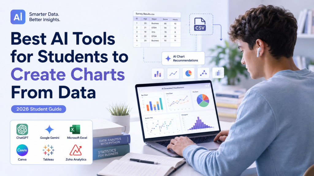
Quick Answer
The best AI tools for students to create charts from data can turn structured CSV, Excel, or spreadsheet data into visualizations while helping with analysis and chart selection. ChatGPT can analyze uploaded spreadsheets and create charts, while Gemini can create charts from uploaded spreadsheets and work directly with Google Sheets.
For most students, the important question is not simply which tool can make the prettiest chart. The better question is which tool can create the right chart from the actual data and help you verify it afterward.
AI can speed up visualization, but students should still check the source data, labels, units, calculations, and chart type before using a visualization in an assignment, report, or presentation.
Introduction
Turning a dataset into a useful chart sounds simple until you actually have the data in front of you.
You might have a spreadsheet containing hundreds of survey responses, several columns of experimental measurements, monthly observations, or results from a class project. The data may be correct, but turning it into a chart that communicates the important information requires several decisions.
Which columns should you use?
Should the result be a bar chart or a line chart?
Would a scatter plot make more sense?
Should percentages be calculated first?
Should categories be grouped?
What should the axes represent?
And perhaps most importantly: does the final chart accurately represent the original data?
This is where AI-powered data visualization tools can be useful.
Modern AI tools can work with structured datasets, answer questions about the data, generate charts, and in some cases help students explore trends or choose a visualization. For example, ChatGPT currently supports common spreadsheet formats such as CSV and XLSX and can create charts from uploaded data.Gemini can also create charts from uploaded spreadsheets, while Gemini in Google Sheets can build charts and provide data-analysis assistance when the relevant feature and plan are available.
But AI does not remove the responsibility of understanding the visualization.
A professional-looking graph can still contain:
• The wrong chart type
• Incorrect aggregation
• Misleading axis scaling
• Missing units
• Incorrect labels
• Excluded data
• Misinterpreted categories
• Unsupported conclusions
That is why this guide takes a different approach.
Instead of simply listing the Best AI Tools for Students to Create Charts From Data, we will build a complete student workflow:
Raw Data → Organize → Clean → Understand → Choose Chart → Generate → Check → Interpret → Export → Use → Verify
The goal is not to make students dependent on AI. The goal is to make chart creation faster while keeping the reasoning and verification process visible.
What Are AI Chart Creation Tools?
AI chart creation tools are software applications that can use natural-language instructions, structured datasets, spreadsheets, or uploaded files to help create data visualizations.
Instead of manually selecting cells, choosing a chart type, configuring every setting, and repeatedly adjusting the result, a student may be able to describe what they want in ordinary language.
For example:
“Create a bar chart comparing the average study hours for each grade level. Use the data in the uploaded spreadsheet, label the y-axis in hours, and do not change the underlying values.”
The tool may then analyze the relevant columns and generate a visualization.
However, the exact capabilities vary considerably between tools.
Some are designed around spreadsheets. Others can analyze uploaded datasets directly. Some provide natural-language interaction, while others are primarily traditional data-visualization platforms with AI features.
For students, the useful distinction is therefore not simply AI tool vs. non-AI tool.
It is:
What data can the tool work with? → What can it actually analyze? → What charts can it produce? → How much control does the student have? → How easily can the result be verified?
AI Chart Creation vs. Traditional Chart Creation
Traditional chart creation usually requires the student to:
AI can reduce some of the manual work.
A student might instead describe the desired comparison and let the tool assist with selecting or generating the visualization.
That does not necessarily make AI better.
Traditional spreadsheet tools often provide more direct control over individual chart settings, while AI can make the initial exploration faster.
The strongest approach is often a combination:
What Makes a Good AI Chart Tool?
For student work, a useful AI chart tool should do more than produce an attractive image.
Look for capabilities such as:
Example: ChatGPT’s current data-analysis capabilities can work with uploaded spreadsheets and create charts, while Google documents that Gemini in Sheets can generate charts and provide data-analysis assistance.
What AI Chart Tools Should Not Do
A chart generator should never be treated as permission to change the data simply to produce a more convincing result.
Students should not ask an AI tool to:
If the dataset has a problem, the correct workflow is to identify and document the problem, not silently alter the evidence.
What Can AI Do With Student Data?
AI can assist at several points in the visualization process, but the amount of assistance depends on the tool, file type, and task.
Organize Data
AI can help students understand the structure of a spreadsheet.
For example, it may identify:
This can be particularly useful when a dataset contains many columns and the student is unsure where to begin.
Summarize Variables
Before creating a chart, students need to understand what their variables represent.
AI can help answer questions such as:
Why this matters: Chart selection depends heavily on the type and meaning of the data.
Identify Potential Relationships
AI can help students explore possible relationships between variables.
For example, a student might ask:
That can help generate ideas for further analysis.
Important: An AI suggestion is not proof that a relationship exists. Students should inspect the data and use an appropriate statistical or visual method before making conclusions.
Generate Charts
This is the most obvious use.
Depending on the tool, students can request visualizations such as:
Current capability example: ChatGPT’s current data-analysis documentation lists support for several chart types, including bar, line, pie, histogram, scatter, box plots, heatmaps, area charts, radar charts, treemaps, bubble charts, and waterfall charts.
Suggest a Chart Type
Some AI tools can also help students decide which visualization may fit their data.
For example:
Why it can help: That can be useful for beginners.
Important: Students should not blindly accept the recommendation. The correct chart depends not only on the columns but also on the question the chart is supposed to answer.
Customize Visualizations
AI-assisted tools may also help students modify:
Example: Gemini’s current documentation says users can create charts from uploaded spreadsheets and customize aspects such as chart type and labels. Customization should improve readability—not simply add decoration.
Explain a Chart
AI can also help students understand a visualization they have created.
For example:
This distinction is important.
Important: A chart can show that two variables move together visually, but that does not automatically establish that one caused the other.
Help Prepare a Chart for a Report
AI can help students improve titles, labels, captions, or explanatory text.
For example:
Final check: Students should still check that the final wording accurately describes the visualization.
How We Selected These AI Chart Tools
The tools in this guide are selected based on their usefulness for real student data visualization, not simply their popularity as AI products.
The evaluation focuses on the practical workflow a student follows from dataset to finished chart.
Data and File Support
A useful tool should work with structured data in a practical format.
Important considerations include:
• CSV support
• Excel/spreadsheet support
• Structured tables
• Upload workflow
• File limitations
For example, ChatGPT currently supports common spreadsheet formats including .csv and .xlsx for data analysis.
AI Assistance
We consider whether the tool can understand natural-language requests such as:
“Compare average scores across the three groups.”
This can make chart creation easier for students who are unfamiliar with complex spreadsheet menus.
Chart Selection
A useful tool should either support multiple chart types or make it easy for students to choose an appropriate visualization.
The tool should not be judged simply by how quickly it produces a chart.
Customization
Students may need to adjust:
• Titles
• Axis labels
• Units
• Categories
• Scale
• Formatting
A chart that cannot be adjusted may be less useful for academic work.
Accuracy and Verification
This is one of the most important criteria.
A tool may produce a technically valid-looking visualization while still making an incorrect aggregation or interpretation.
Therefore, the guide prioritizes tools and workflows that allow students to inspect the underlying data and verify the result.
Student Value
The best tool for a student is not necessarily the most powerful platform available.
We consider:
• Ease of learning
• Practical student workflows
• Free availability where applicable
• Compatibility with common student datasets
• Ease of exporting or sharing results
• Usefulness for assignments and presentations
Privacy Considerations
Student datasets can contain personal, confidential, or unpublished information.
A chart tool should therefore be evaluated not only on visualization features but also on how students should think about the information they upload.
Privacy policies, account settings, institutional requirements, and data-handling practices can vary, so students should check the current terms and policies before uploading sensitive datasets.
Best AI Tools for Students to Create Charts From Data
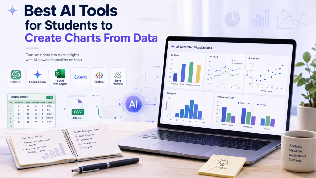
The strongest options are tools that can work with actual structured data rather than simply generating decorative graphics.
For many students, the practical shortlist will center on tools that combine data analysis + chart creation + natural-language interaction.
ChatGPT
ChatGPT can support multiple stages of the data-to-visualization workflow, from exploring a dataset to creating and reviewing charts.
What It Does
ChatGPT can analyze uploaded datasets, answer questions about their contents, create tables, perform calculations, and generate charts. OpenAI’s current documentation lists support for common spreadsheet files such as CSV and XLSX.
This makes it particularly useful when a student wants to move from raw spreadsheet data to an initial visualization without manually performing every step.
Best For
ChatGPT is especially useful for students who want to:
How Students Can Use It
A student might upload a spreadsheet and ask:
That is a stronger workflow than immediately asking for a graph because it separates understanding the data from visualizing the data.
Students can then request the selected chart.
Chart Types
ChatGPT can create several visualization types, including bar, line, pie, histogram, scatter, box, and heatmap-style visualizations, with current documentation noting that some chart types can be interactive while others may be returned as static charts.
Data/File Support
ChatGPT supports common data-analysis file types including CSV and XLSX, along with several other file formats. Exact file capabilities can vary by model, plan, workspace, and account configuration.
Strengths
Limitations
Students should not assume that a generated chart is automatically correct.
OpenAI recommends reviewing generated analysis, code, outputs, and assumptions when relying on data-analysis results.
The tool also does not replace knowledge of the research question or appropriate statistical method.
Free or Paid Access
Availability and limits can vary by account and plan, so students should check the current ChatGPT plan information before relying on a specific feature.
Best Student Scenario
A college student has an Excel dataset from a class project and needs to compare several groups. They want to explore the data, ask questions in plain language, generate a few possible charts, and then verify the final visualization before adding it to a report.
The bigger picture: For that workflow, Best AI Tools for Students to Create Charts From Data should be judged by how well the tool supports the entire process—not merely how quickly it produces a graph.
Google Gemini
Google Gemini can help students move from spreadsheet data to charts, analysis, and visual exploration using natural-language instructions.
What It Does
Google Gemini can work with uploaded spreadsheets and create charts from the data. Google’s current documentation says the Gemini web app can create a chart from uploaded spreadsheet files and lets users customize aspects such as the chart type and labels.
For students already working in Google’s ecosystem, Gemini can be particularly convenient because Gemini in Google Sheets can build charts and graphs, generate data analysis and insights, and work with spreadsheet content. These features require an eligible Google Workspace or Google AI plan.
Best For
Gemini is a strong option for students who:
How Students Can Use It
Suppose you have a spreadsheet containing survey responses.
Instead of immediately asking for a chart, start with:
After reviewing the suggestions, you can ask Gemini to create the selected visualization.
For Google Sheets, a request such as:
can be used as a starting point for chart creation. Google provides similar examples in its documentation for Gemini in Sheets.
Chart Types
The exact chart options available can depend on the Gemini experience and data being used. Students can request common visualizations such as:
Important: Select the chart based on the question and data structure rather than simply choosing the most visually appealing option.
Data/File Support
Gemini can create charts from uploaded spreadsheets, and Gemini in Sheets works directly with Google Sheets. Google notes that Gemini in Sheets works best with native Google Sheets files; Excel files can be converted to Google Sheets before using the relevant Gemini features.
Strengths
Limitations
Gemini’s chart recommendation should still be treated as assistance, not as a final research decision.
Students need to verify:
Feature availability also depends on the Gemini product and eligible plan, so students should check current availability before relying on a particular feature.
Free or Paid Access
Availability of Gemini’s spreadsheet and chart features varies by product and plan. Google currently states that Gemini in Sheets requires an eligible Google Workspace or Google AI plan.
Best Student Scenario
A university student has a Google Sheets dataset from a class survey. Instead of manually experimenting with multiple chart types, the student asks Gemini to identify useful visualizations, creates the selected chart, checks the underlying values, and then adjusts the labels before using the chart in a presentation.
Best AI Tools for Students to Create Charts From Data: Microsoft Excel with Copilot
Microsoft Excel remains one of the most practical environments for student datasets, particularly when the original data is already stored in an Excel workbook.
What It Does
Excel provides traditional chart creation and Recommended Charts, while Copilot in Excel can assist with data analysis and chart creation when the feature is available with the user’s Microsoft 365 setup. Microsoft says Copilot can create and edit charts, PivotTables, and other workbook elements and can surface insights as charts, summaries, trends, or outliers.
Best For
Excel with Copilot is particularly useful for students who:
How Students Can Use It
Start with a clean Excel table.
Then ask Copilot a focused question, such as:
Microsoft’s current documentation says Copilot can use natural-language requests to analyze data and create charts, PivotTables, summaries, trends, and outliers.
Students can also use Excel’s Recommended Charts feature even without relying entirely on AI. Excel analyzes selected data and suggests chart options.
Practical tip: Use AI to explore possible visualizations, then inspect and refine the final chart yourself.
Chart Types
Excel supports a broad range of chart types, including:
Microsoft also documents Recommended Charts and Copilot chart assistance for helping users identify suitable visualizations.
Data/File Support
Excel works directly with Excel workbooks and structured spreadsheet data.
For students already collecting data in .xlsx files, this can reduce the need to move the dataset into another platform.
Copilot can also work with workbook data and create charts that remain connected to the underlying workbook.
Strengths
Limitations
Copilot availability depends on the user’s Microsoft 365 license and environment. Microsoft also recommends reviewing, editing, and verifying AI-generated results.
Excel can also feel more complicated for beginners than a conversational AI interface.
Free or Paid Access
Excel’s traditional chart features are available in supported Excel versions, while Copilot features depend on the applicable Microsoft 365 subscription, license, and organizational settings.
Students should check their school’s Microsoft 365 access before assuming Copilot is included.
Best Student Scenario
An MBA student has several months of sales data stored in Excel and needs a chart comparing performance across categories. Excel provides the underlying data control, while Copilot can help explore the dataset and generate a visualization that the student can then inspect and customize.
Bottom line: For students who already live inside spreadsheets, this makes Excel with Copilot one of the more practical options among the Best AI Tools for Students to Create Charts From Data.
Best AI Tools for Students to Create Charts From Data: Google Sheets with Gemini
Google Sheets with Gemini combines spreadsheet editing with AI-assisted analysis and visualization.
What It Does
Google Sheets with Gemini combines spreadsheet editing with AI-assisted analysis and visualization.
Google currently lists capabilities including:
Best For
This setup is especially useful for students who:
How Students Can Use It
A student can first organize the dataset in Sheets and then ask Gemini to help identify a useful visualization.
For example:
Google’s documentation specifically supports natural-language chart requests in Gemini in Sheets.
Chart Types
The available visualization options depend on the spreadsheet and feature being used. Students can request common charts such as:
Important: The student should still verify whether the selected chart communicates the intended comparison.
Data/File Support
Gemini in Sheets works best with native Google Sheets files. Google notes that Excel files should be converted to Google Sheets to use Gemini features in Sheets.
Strengths
Limitations
Gemini in Sheets requires an eligible Google Workspace or Google AI plan, and feature availability can vary.
Students should also verify calculations and chart choices rather than assuming the AI-generated visualization is automatically correct.
Free or Paid Access
Google Sheets itself has broad availability, but the Gemini features discussed here require an eligible plan. Check Google’s current plan and feature availability before publication or classroom use.
Best Student Scenario
A high school or college student has survey results stored in Google Sheets and needs a few charts for a class presentation. Gemini can help generate initial visualizations, while the student checks the categories, percentages, labels, and source data before using the final charts.
Best AI Tools for Students to Create Charts From Data: Canva
What It Does
Canva has expanded beyond traditional design tools with data-focused features such as Canva Sheets, Magic Charts, and Magic Insights. Canva says Magic Charts can turn spreadsheet data into interactive visualizations and recommend chart types based on the dataset.
This makes Canva particularly interesting for students who need to take real data and turn it into a chart that will eventually appear in a presentation, report, or visual project.
Explore Canva Sheets →Best For
Canva is especially useful for students who want to:
How Students Can Use It
A student can begin with structured data in Canva Sheets and use Magic Charts to create a visualization.
“Use this dataset to compare the average scores of each group. Recommend an appropriate chart, explain why it fits the data, and preserve the original values.”
Canva says Magic Charts can recommend a chart based on the dataset and embed it into a design.
Chart Types
Canva’s current data-visualization tools support a range of chart styles, including familiar options such as:
Canva has also expanded its chart library and data-storytelling capabilities. 1
Data/File Support
Canva Sheets is designed as a spreadsheet environment for working with data, while Canva also supports bringing data into visual designs. Canva says users can import CSV and XLSX files into Canva Sheets, and Sheets can export data in formats including CSV, XLSX, and PDF.
Students should still check the current file and feature availability before starting a project.
Strengths
Limitations
Canva’s biggest strength is also something students need to be careful about: visual design.
A chart can look impressive without being the best visualization for the underlying research question.
Students should verify:
Free or Paid Access
Canva offers free access to parts of its platform, but specific AI, data, collaboration, and design features can vary by plan and may change over time.
Students should check the current Canva plan before relying on a particular feature.
Check Canva Plans →Best Student Scenario
A student has completed a class survey and needs several charts for a presentation. Canva can be useful when the student wants to create the visualization and then place it directly into a polished presentation or report design.
Best AI Tools for Students to Create Charts From Data: Tableau
What It Does
Tableau is a dedicated data-visualization platform rather than a general-purpose chatbot. Its current AI features include Tableau Agent, which can help users explore data, create visualizations, choose chart types, perform time-series analysis, and create calculated fields.
That makes Tableau more relevant for students who want to develop deeper data-visualization skills rather than simply generate a quick chart.
Best For
Tableau is particularly useful for:
How Students Can Use It
A student could ask Tableau Agent:
“Show me the distribution of student grades.”
Or:
“Compare the average result across these groups and recommend an appropriate visualization.”
Tableau documents these types of natural-language requests as examples of Tableau Agent’s capabilities.
Chart Types
Tableau Agent can assist with a wide range of visualization workflows, while the exact availability depends on the Tableau environment and enabled features.
Data/File Support
Tableau is designed around structured data analysis and visualization and can connect to a wide range of data sources.
For students, the important advantage is that Tableau is built specifically around the process of exploring and visualizing data rather than simply generating a decorative chart.
Strengths
Limitations
Tableau can have a steeper learning curve than simpler spreadsheet-based tools.
Its AI capabilities also depend on the Tableau environment, licensing, and administrator settings. Tableau states that some Tableau Agent features require Tableau+ or eligible Tableau Cloud or Server configurations with AI enabled.
Free or Paid Access
Tableau offers a student program that provides eligible students with Tableau Desktop Public Edition at no cost. Tableau’s student page also provides access to its free student journey and learning resources.
However, the availability of specific AI features is separate and can require additional Tableau configurations or subscriptions.
Best Student Scenario
A graduate student wants to move beyond basic spreadsheet charts and learn interactive data visualization for a research project. Tableau can be a stronger long-term learning option than a simple chart generator.
Best AI Tools for Students to Create Charts From Data: Zoho Analytics
What It Does
Zoho Analytics is a dedicated analytics and visualization platform with AI-powered features through Zia.
Zoho’s current documentation describes Ask Zia as an AI assistant that can help users create visualizations using natural-language requests.
Best For
Zoho Analytics can be relevant for students who need:
How Students Can Use It
A student could ask Zia a question such as:
“Create a visualization comparing the average score across these groups.”
The tool can then assist with generating an appropriate visualization.
Zoho describes Ask Zia as a way for non-technical users to generate visualizations by typing or speaking what they need.
Chart Types
Zoho Analytics supports a broad range of visualization options. Its current product information lists more than 50 visualizations, while recent updates have added additional chart types and visual components.
Data/File Support
Zoho Analytics is designed to connect and blend data from many sources, including files, feeds, business applications, databases, and other data sources.
For a typical student assignment, however, a simpler spreadsheet-based workflow may be easier if the dataset is small.
Strengths
Limitations
Zoho Analytics may be more powerful than necessary for a simple class assignment.
Students should also consider the learning curve and current plan limitations before choosing it for a small project.
Free or Paid Access
Zoho Analytics has different access and pricing options, and limits can vary by plan. Students should check the current official pricing and feature availability before choosing it.
Best Student Scenario
An MBA or graduate student is working with multiple datasets and wants to explore relationships through dashboards rather than creating one isolated chart. Zoho Analytics can make more sense in that situation than a basic spreadsheet workflow.
How to Create Charts From Data With AI
Creating the chart is only one stage of the process.
A reliable student workflow should look like this:
Prepare → Clean → Understand → Define → Select → Generate → Check → Refine → Interpret → Export → Review
Step 1 — Prepare the Dataset
Before uploading anything to an AI tool, organize your data.
Important: Do not begin visualization with a dataset you do not understand.
Step 2 — Clean Obvious Errors
Look for:
For example, if one group is written as “Freshman” and another row uses “freshman,” determine whether they represent the same category before creating a chart.
Step 3 — Understand Columns and Variables
Identify:
Before visualization: You should know what each variable means before asking AI to visualize it.
Step 4 — Define What Question the Chart Should Answer
This is one of the most important steps.
Do not start with: “Make me a chart.”
Start with: “What do I need this chart to help my reader understand?”
Core principle: The chart should serve the question—not the other way around.
Step 5 — Choose the Appropriate Chart Type
Use the decision framework from earlier.
If you are uncertain: Ask AI to recommend options, but require an explanation.
Why this helps: This gives you an opportunity to make an informed decision.
Step 6 — Upload or Provide the Data to the AI Tool
Use the supported file format for your selected platform.
If the dataset contains names, email addresses, student IDs, or other sensitive information, remove or anonymize those fields when they are not needed for the visualization.
Step 7 — Generate the First Chart
Give the AI a precise instruction.
“Using only the supplied dataset, create a bar chart comparing the average score across the four groups. Label the x-axis with group names and the y-axis as score. Do not invent or modify values.”
Treat the first visualization as a draft: The first visualization should be considered a draft, not the final answer.
Step 8 — Check Labels, Axes, Units, and Categories
Before worrying about colors or design, check the information.
Priority: Verify the information first. Colors and visual design should come after the chart’s accuracy and clarity have been checked.
Step 9 — Compare the Chart Against the Original Data
Do not verify only the appearance of the chart. Verify the underlying values and calculations against the original dataset.
Step 10 — Improve Formatting and Readability
Only after accuracy is confirmed should you refine the appearance.
The goal is readability—not decoration.
Step 11 — Interpret the Chart
Describe what the chart actually shows.
“Group A had the highest average score in the dataset.”
“Group A performed better because its students studied more.”
Be careful with causal explanations: The second statement introduces a causal explanation that the chart may not establish.
Step 12 — Export the Final Version
Export using the format required by your assignment.
Keep the original dataset and editable chart whenever possible.
Step 13 — Perform a Final Human Verification
Before submission, check:
Every step should agree.
That final check is what turns an AI-generated visualization into a responsible academic chart.
How to Prompt AI to Create a Chart From Data
A good prompt gives the AI enough information to understand the dataset and the purpose of the visualization.
Use these copy-and-paste prompts as starting points. Replace the bracketed sections with the variables, categories, time periods, or research questions from your own dataset.
Bar Chart Prompt
Copy & Paste“Using only the supplied dataset, create a bar chart comparing [variable] across [categories]. Explain why a bar chart is appropriate, label both axes clearly, include the correct units, and do not invent, remove, or modify any values. Flag missing or ambiguous data before creating the chart.”
Line Chart Prompt
Copy & Paste“Using only the supplied data, create a line chart showing how [variable] changes over [time period]. Use the correct date order, label the axes and units, preserve the original values, and explain why a line chart is appropriate.”
Scatter Plot Prompt
Copy & Paste“Create a scatter plot showing the relationship between [variable X] and [variable Y]. Use only the supplied values, label both axes and units, identify any obvious outliers without removing them, and do not claim that one variable causes the other.”
Histogram Prompt
Copy & Paste“Create a histogram showing the distribution of [numerical variable]. Explain how the values were grouped into bins, preserve the supplied data, label the axes clearly, and flag missing or unusual values before creating the chart.”
Comparison Chart Prompt
Copy & Paste“Compare [Group A, Group B, Group C] using the most appropriate chart for the supplied data. First explain which chart type you recommend and why. Then create the chart using only the original values and clearly label categories, units, and totals.”
Survey-Response Chart Prompt
Copy & Paste“Using only the supplied survey responses, create an appropriate chart showing the distribution of responses to [question]. Preserve all valid response categories, explain how the frequencies or percentages were calculated, and flag missing responses before creating the visualization.”
Research-Data Chart Prompt
Copy & Paste“Review this research dataset and identify the variables relevant to my research question: [question]. Recommend an appropriate visualization, explain why it fits the data, and create the chart only after identifying the relevant columns. Do not invent values or make causal claims.”
Presentation Chart Prompt
Copy & Paste“Create a clean, readable chart from this dataset for a student presentation. Use only the supplied data, choose a chart type appropriate for the research question, use a concise title, label axes and units clearly, avoid unnecessary decoration, and explain any calculations or transformations performed.”
Best practice: Ask AI to explain its chart choice and calculations before accepting the visualization. Always compare important results with the original data.
The strongest prompts do not simply ask AI to make a chart. They tell it to use the supplied data, explain its decisions, preserve the source values, and flag uncertainty.
That makes the workflow behind the Best AI Tools for Students to Create Charts From Data much safer and more useful for academic work.
How to Check Whether an AI-Generated Chart Is Correct
A chart can look polished and still be wrong.
This is one of the most important things students should understand when using AI for data visualization. AI can select the wrong columns, apply an unexpected calculation, group categories incorrectly, or interpret missing values in a way you did not intend.
Before placing an AI-generated chart into an assignment, report, or presentation, compare it with the original dataset.
Check the Data Values
Pick several values from the original dataset and compare them with the chart.
If the chart shows:
Verify that the displayed values actually match the source data.
If the chart contains an average, do not assume the AI calculated it correctly. Recheck the calculation when the result matters to your assignment or research.
Check Categories and Grouping
Make sure the AI did not accidentally combine different categories.
For example, a survey might contain: High school, College, Graduate.
If the chart combines college and graduate students without explanation, the visualization may no longer answer your original question.
Check the Axis Scale
Look carefully at both axes.
Ask:
A truncated axis can make a small difference appear much larger than it actually is.
Check Units and Labels
A chart showing temperature, distance, weight, percentage, or test scores should make the measurement unit clear when applicable.
For example: Temperature (°F) is more useful than simply: Temperature.
Similarly, make sure the chart title accurately describes what is being displayed.
Check Missing Values
If your dataset contains blank responses, missing measurements, or incomplete records, find out how they were handled.
“Identify all missing values relevant to this chart and explain whether they were excluded, grouped, or treated in another way.”
Do not allow the tool to silently fill missing information unless that transformation is appropriate, documented, and justified.
Check Calculations and Percentages
Percentages deserve special attention.
If a chart says that 40% of students selected an option, verify:
Also confirm what the denominator represents.
A percentage calculated from all survey respondents can be different from a percentage calculated only from people who answered a particular question.
Check Outliers
An unusual value should not automatically be deleted.
Ask whether it represents:
The chart should represent the dataset appropriately rather than removing inconvenient observations.
Compare the Chart With the Original Dataset
The safest final check is:
Final verification: If any stage does not match the previous stage, stop and investigate before submitting the work.
The Best AI Tools for Students to Create Charts From Data can make visualization much faster, but the student remains responsible for checking whether the final chart accurately represents the data.
Common AI Chart Mistakes Students Should Avoid
AI-assisted visualization can save time, but it can also introduce mistakes that are easy to overlook.
Using the Wrong Chart Type
A chart can be technically attractive but unsuitable for the question.
For example, using a pie chart to compare 15 categories may make the results difficult to interpret.
Always start with: What question should this chart answer?
Misleading Axis Scale
An unusual axis scale can exaggerate or hide differences.
Before submission, check the scale and ask whether it gives the reader a fair representation of the data.
Missing Units
A numerical axis without units can make a chart ambiguous.
Always include units when they are relevant.
Incorrect Aggregation
AI may calculate:
Make sure the aggregation matches your research question.
Invented Data
Never assume that an AI-generated number is part of your original dataset.
If the tool creates an example value, estimate, or prediction, it must not be presented as an observed value.
“Use only the supplied data. Do not invent missing values or observations.”
Ignoring Missing Values
Missing data can affect the result.
A chart based on incomplete responses may require an explanation, especially in research or survey work.
Confusing Correlation With Causation
A scatter plot may show that two variables are associated. That does not automatically mean one caused the other.
For example, if students who study more also tend to have higher scores, the chart alone cannot prove that study time caused the higher scores.
Using Too Many Categories
A chart with dozens of categories can become difficult to read.
Sometimes grouping related categories or choosing a different visualization provides a clearer result.
Overloading the Chart With Colors
More colors do not necessarily make a chart better.
Use color to communicate meaningful differences, not simply to make the visualization look impressive.
Using 3D Charts Unnecessarily
Three-dimensional effects can make values harder to compare.
For most academic charts, a simple two-dimensional visualization is easier to read.
Truncated Axes
A truncated axis can make differences look dramatic.
Students should check whether the scale could mislead the reader.
Copying AI-Generated Interpretations Without Checking
AI may generate a confident explanation that goes beyond what the chart actually demonstrates.
Always separate:
Final principle: A polished visualization is not automatically an accurate visualization. Check the data, calculations, chart design, and interpretation before using an AI-generated chart in academic work.
How to Use AI-Generated Charts in Academic Work
AI-generated charts can be useful in many types of student work, provided the visualization is accurate and its use follows the applicable academic requirements.
Research Papers
Charts can summarize research findings and make numerical comparisons easier to understand.
A research paper may use:
The chart should support the research question rather than simply decorate the paper.
Lab Reports
Students can use charts to present experimental measurements and compare results across conditions.
For example, a line chart may show how a measurement changes during an experiment, while a scatter plot may help examine the relationship between two numerical variables.
Keep the original measurements available so the final chart can be verified.
Survey Projects
Charts can make survey results easier to communicate.
Common examples include:
- Response frequencies
- Percentages
- Group comparisons
- Likert-scale responses
- Demographic distributions
However, students should analyze and organize the survey responses before creating the final visualization.
Class Assignments
For a typical class assignment, AI may help students create a first visualization quickly.
The student should still:
- Understand the dataset
- Select an appropriate chart
- Check the calculations
- Review the labels
- Follow the assignment instructions
Thesis and Dissertation Work
Graduate students working on larger datasets may use AI-assisted visualization during exploratory analysis.
However, research-level work often requires greater methodological transparency.
Students should document:
- Data source
- Transformations
- Calculations
- Chart-selection reasoning
- Analysis methods
- Relevant AI assistance when required
Presentations
Charts can be especially useful in presentations because they allow an audience to understand a comparison or trend quickly.
Keep presentation charts simple. Avoid putting every available variable into one visualization.
Posters
Academic posters require charts that remain readable from a reasonable viewing distance.
Use:
- Clear titles
- Large enough labels
- High contrast
- Minimal clutter
- Short explanatory captions when needed
Always follow the formatting requirements of your course, conference, or institution.
Core principle: Use AI to make visualization more efficient, but keep the student responsible for understanding the data, checking the chart, and following the requirements of the academic work.
AI Charts for Survey Data
Survey datasets are one of the most common situations where students need to create charts.
But students should avoid the mistake of visualizing everything before understanding the responses.
A better workflow is:
Collect Responses → Clean Data → Analyze Responses → Select Variables → Choose Chart → Generate → Verify
Multiple-Choice Responses
For a question such as:
“Which study method do you use most often?”
A bar chart can clearly compare the number or percentage of students selecting each option.
Likert-Scale Responses
Questions using scales such as:
Strongly Agree → Agree → Neutral → Disagree → Strongly Disagree
can often be visualized with grouped or stacked bar charts.
The appropriate choice depends on the research question and how the responses need to be compared.
Demographic Categories
Survey demographics such as:
can be represented using bar charts or other appropriate categorical visualizations.
Avoid exposing personally identifiable information.
Frequency Distributions
If the survey contains a numerical variable such as study hours, a histogram may be more useful than a simple category chart.
This allows students to see how responses are distributed rather than only comparing broad categories.
Cross-Tab Comparisons
Students may want to compare one survey response across another variable.
Study method × Grade level
or
Preferred learning format × Academic program
These comparisons can reveal differences between groups, but the student should make sure the grouping and percentages are calculated correctly.
Workflow principle: For students following a complete survey-analysis workflow, chart creation should happen after the data has been organized and analyzed, not as a replacement for analysis.
AI Charts for Research Data
Research datasets often require more careful visualization because the chart may influence how readers understand the findings.
Research datasets often require more careful visualization because the chart may influence how readers understand the findings.
Experimental Results
Students can use charts to compare measurements across experimental conditions.
For example:
Choose a chart that clearly represents the experimental design.
Observational Data
Observational datasets may contain measurements collected across people, locations, dates, or other conditions.
Charts can help identify:
Important: Visualization alone does not establish causality.
Correlation Data
When examining two numerical variables, scatter plots are often useful.
Hours studied → Exam score
The chart may help reveal whether the variables appear related.
Students should avoid writing: “Studying more causes higher grades.” unless the research design and statistical analysis actually support that conclusion.
Time-Series Measurements
When measurements are collected over time, line charts are often useful.
Examples include:
Make sure dates are correctly ordered and that the intervals are meaningful.
Group Comparisons
Research projects often compare multiple groups.
The appropriate visualization depends on whether the goal is to compare averages, distributions, or individual observations.
Research principle: The Best AI Tools for Students to Create Charts From Data can assist with generating these visualizations, but students should understand the variables and research design before accepting an AI recommendation.
How to Make Academic Charts More Readable
A correct chart can still be difficult to understand if the presentation is poor.
Use a Clear Title
The title should tell the reader what the chart represents.
Results
Average Exam Score by Study Method
Label the Axes
Readers should immediately understand what each axis represents.
Include units where appropriate.
Use an Appropriate Scale
Keep the scale consistent and avoid unnecessary visual distortion.
Keep Fonts Legible
A chart used in a report or presentation should remain readable at its intended size.
Limit Visual Clutter
Remove unnecessary:
Use Consistent Formatting
If an assignment contains several charts, use a consistent visual style where appropriate.
For example, maintain consistent:
Add Captions or Source Notes When Required
Academic assignments may require captions, source information, or notes explaining how the chart was created.
Follow the style guide or instructor requirements rather than assuming one format applies everywhere.
The key principle: The best visualization is usually not the most decorative one. It is the one that lets the reader understand the important information quickly and accurately.
Free vs Paid AI Chart Tools for Students
Students do not always need a paid AI tool to create useful charts. For simple assignments, a spreadsheet or free AI feature may be enough. Paid plans can become more useful when you need higher usage limits, larger files, advanced analysis, additional export options, or specialized visualization features.
When Free Tools Are Enough
Free or already-available tools can usually work well for:
• Small CSV or spreadsheet datasets
• Basic bar and line charts
• Simple survey visualizations
• Class assignments
• Basic presentations
• Learning chart-selection concepts
Before choosing a tool, check its current file, usage, and export limits because these can change.
When Paid Features May Help
Paid access may be worth considering when you regularly work with:
• Larger datasets
• Multiple files
• Advanced analysis
• Interactive dashboards
• More customization
• Higher usage limits
• Specialized export requirements
Do not pay simply because a tool has more features. Choose based on what your assignment actually requires.
Student Data Privacy and AI Chart Tools
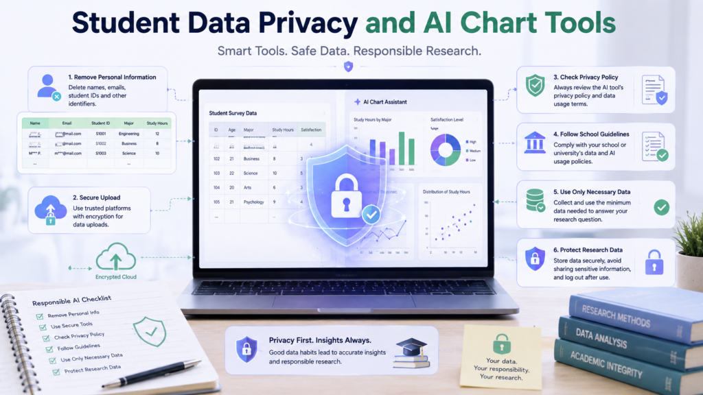
Before uploading a dataset to an AI service, check what information it contains.
A student dataset may include:
• Names
• Email addresses
• Student IDs
• Survey responses
• Research participants’ information
• Unpublished research data
Remove unnecessary personally identifiable information whenever possible.
A Safer Upload Checklist
Before uploading data:
- Remove unnecessary personal information.
2. Keep only the columns required for the analysis.
3. Check your school’s or institution’s data policy.
4. Review the AI tool’s current privacy and data-handling information.
5. Avoid uploading sensitive research data unless you are permitted to do so.
Cloud-based AI tools may process uploaded files according to their current service and account settings. Never assume that an AI tool is completely private without checking its current policies.
Academic Integrity and Responsible AI Use
AI can assist with chart creation, but students remain responsible for the final visualization.
That includes:
• Using accurate data
• Choosing an appropriate chart
• Checking calculations
• Interpreting results correctly
• Citing sources when required
• Following instructor and institutional AI policies
Do not submit an AI-generated chart or interpretation without understanding how it was produced.
A responsible workflow is:
AI assistance → Student verification → Student interpretation → Final review
The Best AI Tools for Students to Create Charts From Data should support your understanding of the dataset—not replace your responsibility for the academic work.
Traditional Chart Creation vs AI-Assisted Chart Creation
AI can make chart creation faster, but traditional spreadsheet tools still provide valuable control. The better approach depends on the assignment, dataset, and student’s experience.
| Factor | Manual Spreadsheet Workflow | AI-Assisted Workflow |
|---|---|---|
| Speed | More manual steps | Faster initial visualization |
| Learning curve | Requires spreadsheet skills | Easier to start with natural language |
| Control | High | Varies by tool |
| Accuracy checking | Student-controlled | Still requires student verification |
| Customization | Usually extensive | Depends on the platform |
| Transparency | Steps are easier to inspect | AI calculations may need closer review |
| Best use | Detailed chart control | Exploration and faster first drafts |
The practical takeaway: AI can make the first visualization faster, while traditional spreadsheet tools often provide greater direct control. For student work, the strongest workflow is often AI-assisted exploration followed by student verification and final refinement.
AI should therefore be treated as an assistant, not an automatic replacement for understanding data.
Best AI Chart Workflow for Students
Dataset
Keep the original data unchanged.
Clean
Check duplicates, missing values, inconsistent labels, and obvious errors.
Define Question
Decide exactly what the visualization needs to show.
Select Chart
Match the question and data type to the appropriate chart.
Generate
Ask the AI tool to create the first visualization using only the supplied data.
Verify
Check values, calculations, labels, units, categories, and scale.
Refine
Improve readability without adding unnecessary decoration.
Interpret
Describe what the chart actually demonstrates.
Export
Use the format required by your assignment.
Cite / Document
Include sources or AI-use information when required.
Final Review
Compare the finished chart with the original dataset one last time.
Why this workflow matters: This workflow makes the Best AI Tools for Students to Create Charts From Data much more useful because the tool becomes one part of a reliable process rather than the entire process.
Expert Tips for Better AI-Generated Charts
• Ask AI to explain its chart choice before generating the final visualization.
• Keep the original dataset so you can verify the result.
• Use the simplest chart that answers the question clearly.
• Check units and labels before worrying about colors or design.
• Never accept invented values or unexplained transformations.
• Ask AI to flag missing or ambiguous data.
• Avoid decorative charts that make the information harder to understand.
• Review the final visualization manually before submitting it.
Myth vs Reality
Myth: “If AI created the chart, it must be correct.”
AI-generated charts can contain incorrect calculations, labels, groupings, or interpretations. Always verify the visualization against the source data.
Myth: “More visual effects make a chart better.”
Academic charts should prioritize clarity, accuracy, and readability over decoration.
Myth: “AI can always choose the correct chart.”
Chart selection depends on the research question, variable types, and intended comparison. AI can suggest an option, but the student should evaluate it.
Myth: “The fastest chart is the best chart.”
A slightly slower workflow that includes data verification is usually more valuable than a fast but unchecked visualization.
Bottom line: AI can accelerate chart creation, but accuracy still depends on the student’s understanding, verification, and final review of the data.
Conclusion
Creating a chart with AI is only the beginning. A reliable student workflow starts with understanding the dataset, defining the question, choosing an appropriate visualization, generating the chart, and checking the result against the original data.
Tools such as ChatGPT, Gemini, Excel with Copilot, Canva, Tableau, and Zoho Analytics can support different stages of this process. The best choice depends on your dataset, assignment requirements, desired level of customization, and experience.
The most important rule is simple:
Let AI speed up chart creation, but never let it replace data verification.
When students use the Best AI Tools for Students to Create Charts From Data responsibly, they can spend less time on repetitive chart-building tasks while keeping control over accuracy, interpretation, and academic decisions.
Continue Learning
If you’re working with academic datasets, these related IndiaAITools guides can help you build the next stage of your workflow:
“`0Frequently Asked Questions
Quick answers to common questions students have about using AI tools to create charts from datasets.
What is the best AI tool for creating charts from data?
There is no single best option for every student. ChatGPT is useful for conversational data analysis, Gemini works well within Google’s ecosystem, Excel with Copilot is useful for spreadsheet-based projects, and Tableau is better suited to more advanced visualization workflows.
Can AI create charts from Excel data?
Yes. Several AI-assisted tools can work with spreadsheet data. ChatGPT supports spreadsheet uploads, while Excel with Copilot can assist directly within supported Excel environments.
Can AI create charts from CSV files?
Yes. Tools that support CSV data can analyze the structured information and generate appropriate visualizations. Always check that the columns and values were interpreted correctly.
Can students use AI to create charts for assignments?
Potentially, depending on the assignment and instructor’s rules. Students should follow their school’s AI policy and remain responsible for checking the accuracy of the final chart.
Which AI tool is best for survey charts?
ChatGPT, Gemini, and spreadsheet-based AI tools can all be useful for survey visualization. The better choice depends on where the survey data is stored and what comparison you need to show.
Can AI choose the right chart type?
AI can recommend a chart based on the data and request, but it cannot replace your judgment. The final choice should depend on the research question, variable types, and intended comparison.
How do I ask AI to create a chart from data?
Tell the AI which data to use, what question the chart should answer, which chart type you prefer if known, and how the axes and units should be labeled. Also instruct it not to invent or modify values.
Tip: Ask the tool to explain its chart choice and identify any missing or ambiguous data before generating the visualization.
How do I check if an AI-generated chart is correct?
Compare the chart with the original dataset. Check values, calculations, categories, totals, percentages, axis scales, units, labels, missing values, and any transformations performed.
Are AI-generated charts allowed in academic work?
It depends on the course, instructor, and institution. Check the applicable academic-integrity and AI-use requirements before submitting an AI-assisted visualization.
Can AI analyze data and create charts at the same time?
Yes, some AI tools can analyze uploaded or connected datasets and then generate visualizations. However, students should separately verify the analysis and chart before using the results academically.
Remember: AI can speed up chart creation, but the student remains responsible for understanding the data, checking the visualization, and following the applicable academic requirements.